14 KiB
+++ categories = ["explanation", "reference"] description = "How to extend the topbar" options = ["editURL"] title = "Topbar" weight = 4 +++
The theme comes with a reasonably configured topbar. You can learn how to configure the defaults in this section.
Nevertheless, your requirements may differ from this configuration. Luckily, the theme has you covered as the topbar, its buttons, and the functionality behind these buttons are fully configurable by you.
{{% notice tip %}} All mentioned file names below can be clicked and show you the implementation for a better understanding. {{% /notice %}}
Areas
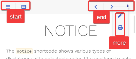
The default configuration comes with three predefined areas that may contain an arbitrary set of buttons.
- start: shown between menu and breadcrumb
- end: shown on the opposite breadcrumb side in comparison to the start area
- more: shown when pressing the {{% button style="transparent" icon="ellipsis-v" %}}{{% /button %}} more button in the topbar
While you cannot add additional areas in the topbar, you are free to configure additional buttons that behave like the more button, providing further user-defined areas.
Buttons
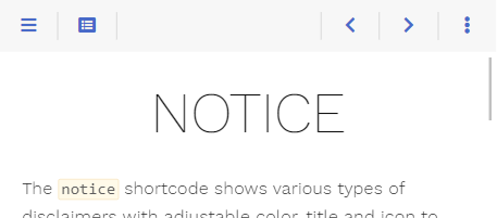
The theme ships with the following predefined buttons (from left to right in the screenshot):
- {{% button style="transparent" icon="bars" %}}{{% /button %}} sidebar: opens the sidebar flyout if in mobile layout
- {{% button style="transparent" icon="list-alt" %}}{{% /button %}} toc: opens the table of contents in an overlay
- {{% button style="transparent" icon="pen" %}}{{% /button %}} edit: browses to the editable page if the
editURLparameter is set - {{% button style="transparent" icon="print" %}}{{% /button %}} print: browses to the chapter's printable page if print support was activated
- {{% button style="transparent" icon="chevron-left" %}}{{% /button %}} prev: browses to the previous page if there is one
- {{% button style="transparent" icon="chevron-right" %}}{{% /button %}} next: browses to the [next page]authoring/frontmatter/topbar(#arrow-navigation) if there is one
- {{% button style="transparent" icon="ellipsis-v" %}}{{% /button %}} more: opens the overlay for the more area
Not all buttons are displayed at every given time. This is configurable (see below if interested).
Redefining Areas
Each predefined area and button comes in its own file. By that, it is easy for you to overwrite an area file in your installation, reusing only the buttons you like.
E.g., you can redefine the predefined end area by adding the file layouts/partials/topbar/area/end.html in your installation (not in the theme itself) to remove all but the more button.
The below example sets an explicit value for the onempty parameter, overriding the specific default value for this button (these defaults vary depending on the button). The parameter causes the more button to always be displayed instead of hiding once its content is empty.
{{ partial "topbar/button/more.html" (dict
  "page" .
  "onempty" "disable"
)}}
Defining Own Buttons
Button Types
The theme distinguishes between two types of buttons:
- button: a clickable button that either browses to another site, triggers a user-defined script or opens an overlay containing user-defined content
- area-button: the template for the {{% button style="transparent" icon="ellipsis-v" %}}{{% /button %}} more button, to define your own area overlay buttons
Button Parameter
Screen Widths and Actions
Depending on the screen width, you can configure how the button should behave. Screen width is divided into three classes:
- s: (controlled by the
onwidthsparameter) mobile layout where the menu sidebar is hidden - m: (controlled by the
onwidthmparameter) desktop layout with visible sidebar while the content area width still resizes - l: (controlled by the
onwidthlparameter) desktop layout with visible sidebar once the content area reached its maximum width
For each width class, you can configure one of the following actions:
show: the button is displayed in its given areahide: the button is removedarea-XXX: the button is moved from its given area into the areaXXX; for example, this is used to move buttons to the more area overlay in the mobile layout
Hiding and Disabling Stuff
While hiding a button depending on the screen size can be configured with the above-described hide action, you may want to hide the button on certain other conditions as well.
For example, the print button in its default configuration should only be displayed if print support was configured. This is done in your button template by checking the conditions first before displaying the button (see layouts/partials/topbar/button/print.html).
Another preferred condition for hiding a button is if the displayed overlay is empty. This is the case for the toc (see layouts/partials/topbar/button/toc.html) as well as the more button (see layouts/partials/topbar/button/more.html) and controlled by the parameter onempty.
This parameter can have one of the following values:
disable: the button is displayed in a disabled state if the overlay is emptyhide: the button is removed if the overlay is empty
If you want to disable a button containing no overlay, this can be achieved by an empty href parameter. An example can be seen in the prev button (see layouts/partials/topbar/button/prev.html) where the URL for the previous site may be empty.
Reference
Button
Contains the basic button functionality and is used as a base implementation for all other buttons (layouts/partials/topbar/func/button.html).
Call this from your own button templates if you want to implement a button without an overlay like the print button (layouts/partials/topbar/button/print.html) or with an overlay containing arbitrary content like the toc button (layouts/partials/topbar/button/toc.html).
For displaying an area in the button's overlay, see Area-Button.
Parameter
| Name | Default | Notes |
|---|---|---|
| page | <empty> | Mandatory reference to the page. |
| class | <empty> | Mandatory unique class name for this button. Displaying two buttons with the same value for class is undefined. |
| href | <empty> | Either the destination URL for the button or JavaScript code to be executed on click. - If starting with javascript: all following text will be executed in your browser- Every other string will be interpreted as URL - If empty, the button will be displayed in a disabled state regardless of its content |
| icon | <empty> | Font Awesome icon name. |
| onempty | disable |
Defines what to do with the button if the content parameter was set but ends up empty: - disable: The button is displayed in a disabled state.- hide: The button is removed. |
| onwidths | show |
The action that should be executed if the site is displayed in the given width: - show: The button is displayed in its given area- hide: The button is removed.- area-XXX: The button is moved from its given area into the area XXX. |
| onwidthm | show |
See above. |
| onwidthl | show |
See above. |
| hint | <empty> | Arbitrary text displayed in the tooltip. |
| title | <empty> | Arbitrary text for the button. |
| content | <empty> | Arbitrary HTML to put into the content overlay. This parameter may be empty. In this case, no overlay will be generated. |
Area-Button
Contains the basic functionality to display area overlay buttons (layouts/partials/topbar/func/area-button.html).
Call this from your own button templates if you want to implement a button with an area overlay like the more button (layouts/partials/topbar/button/more.html).
Parameter
| Name | Default | Notes |
|---|---|---|
| page | <empty> | Mandatory reference to the page. |
| area | <empty> | Mandatory unique area name for this area. Displaying two areas with the same value for area is undefined. |
| icon | <empty> | Font Awesome icon name. |
| onempty | disable |
Defines what to do with the button if the content overlay is empty: - disable: The button is displayed in a disabled state.- hide: The button is removed. |
| onwidths | show |
The action that should be executed if the site is displayed in the given width: - show: The button is displayed in its given area- hide: The button is removed.- area-XXX: The button is moved from its given area into the area XXX. |
| onwidthm | show |
See above. |
| onwidthl | show |
See above. |
| hint | <empty> | Arbitrary text displayed in the tooltip. |
| title | <empty> | Arbitrary text for the button. |
Predefined Buttons
The predefined buttons by the theme (all other buttons besides the more and toc button in layouts/partials/topbar/button).
Call these from your own redefined area templates if you want to use default button behavior.
The <varying> parameter values are different for each button and configured for standard behavior as seen on this page.
Parameter
| Name | Default | Notes |
|---|---|---|
| page | <empty> | Mandatory reference to the page. |
| onwidths | <varying> | The action that should be executed if the site is displayed in the given width: - show: The button is displayed in its given area- hide: The button is removed.- area-XXX: The button is moved from its given area into the area XXX. |
| onwidthm | <varying> | See above. |
| onwidthl | <varying> | See above. |
Predefined Overlay-Buttons
The predefined buttons by the theme that open an overlay (the more and toc button in layouts/partials/topbar/button).
Call these from your own redefined area templates if you want to use default button behavior utilizing overlay functionality.
The <varying> parameter values are different for each button and configured for standard behavior as seen on this page.
Parameter
| Name | Default | Notes |
|---|---|---|
| page | <empty> | Mandatory reference to the page. |
| onempty | disable |
Defines what to do with the button if the content overlay is empty: - disable: The button is displayed in a disabled state.- hide: The button is removed. |
| onwidths | <varying> | The action that should be executed if the site is displayed in the given width: - show: The button is displayed in its given area- hide: The button is removed.- area-XXX: The button is moved from its given area into the area XXX. |
| onwidthm | <varying> | See above. |
| onwidthl | <varying> | See above. |

